It’s Friday the 13th!!!! AHHHHHHHH!!!!!
Okay, now that I have that out of my system, let’s talk about something serious.
Working in two different library systems has had its benefits. I’ve learned about cataloging and call numbers, and why certain books are classified the way they are. I was changing the label on a book while at work this very day and I realized something; something many writers who self-publish may not think about. To be honest, some major publishing houses may not think about this, either. Libraries use spine labels on the outside of each book, so the book can be properly shelved and patrons can locate it. Sometimes they also use genre stickers, such as “Mystery” or “Science Fiction”. This also helps with shelving and tells patrons what type of book they’re holding.
What you decide to include on the spine of your book and where you choose to place it can be affected by what libraries need to do in order to label it. Here’s an example: the book featured below is a copy of The Invention of Hugo Cabret, by Brian Selznick. The first picture is the cover, while the second picture is the spine. My library uses both spine labels and genre stickers. In this case, we used a “Graphic Novel” sticker, because the book was cataloged as such. Can you read the title on the spine?

Can you read the title on the spine?
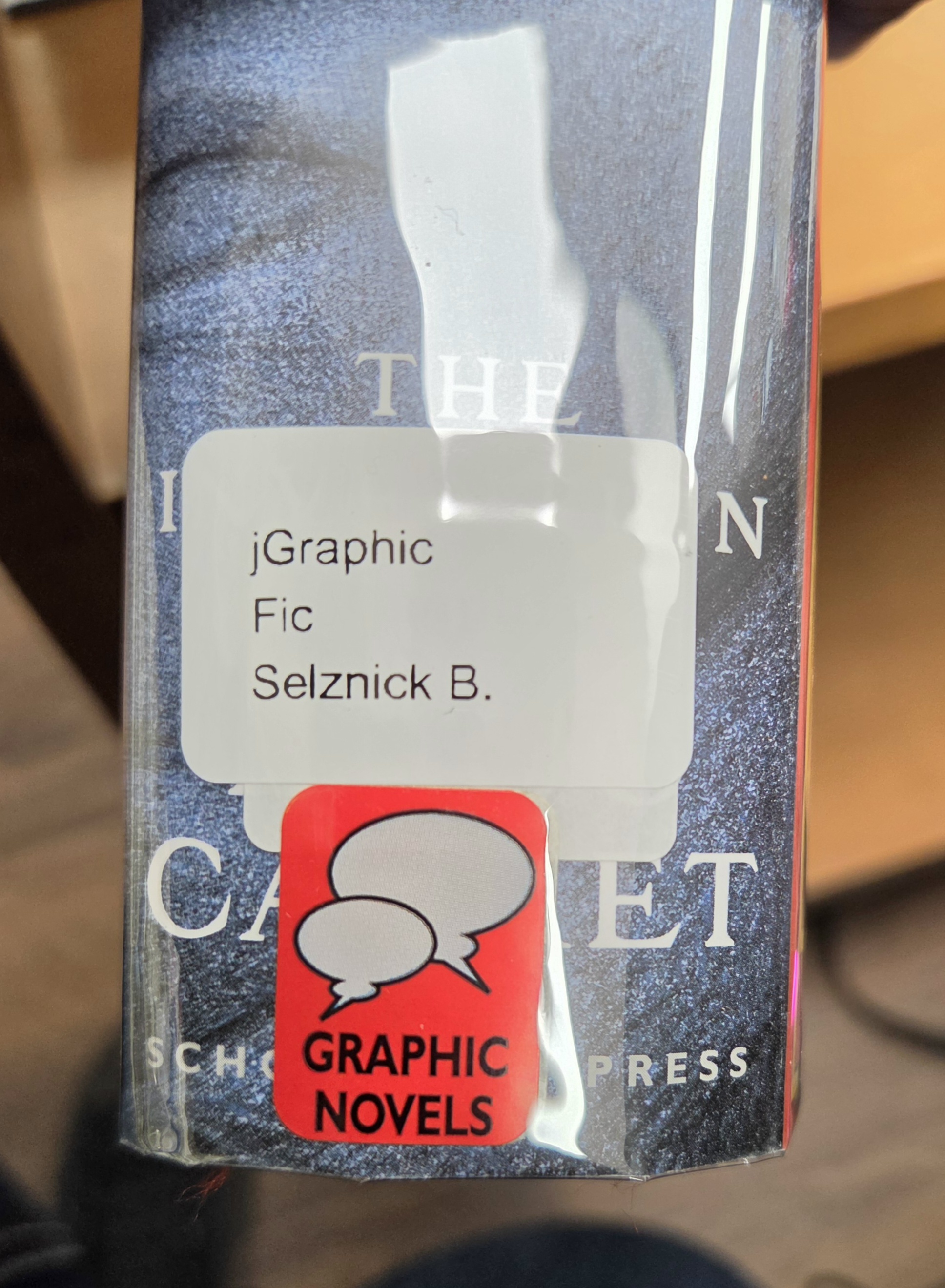
Unfortunately the publisher placed the title of the book in the very same place most libraries place their spine labels. You’re probably thinking, “Why not place the spine label higher? Well, Hampton Public doesn’t do that, at least, we try not to (or I try not to). If the spine labels were placed in random locations on every book, they would look odd and unorganized on the shelf. If you’re a self-published author, there’s a good chance you’re going to create your own cover and spine. If you ever want your book to be available in a library, you may want to give the design of your spine some careful thought. You want people to be able to read it. I’ve come across many books with the same situation as the one above. Sometimes the author’s name is HUGE while the title is so tiny you barely notice it (see most David Baldacci books). When you design your spine, or even if you let someone else design it, keep in mind the idea that your book may become available in multiple places, including a library. I recommend placing most of the content on the spine as close to the center as possible. You don’t want anything important to get covered up.
Have a great day, everyone, and keep writing.

